In the characteristic bold graphic style of the brand identity, the CoSeed F1 livery was predicated on the use of linear striping that complements the CoSeed ‘seedling’ logomark without detracting from its prominence.
Brandmarks with unusual proportions present a challenge in the context of most any livery, and CoSeed’s is no different. The solution typically relies on how best to create interest with an appropriate division of sponsor space while introducing the simplest forms possible – in this case, a series of alternating linear stripes.

CoSeed F1 Livery
Initially, a patterned approach was considered, derivative of the mark itself, but was ultimately eliminated in favor of a more fluent overall design. It was clear the iconography would be emphasized through repetition and placement. Rather than sidestep the brandmark, the decision to maintain the icon as an integral part of the stripe design, with a treatment that doesn’t compete, makes the seedling logomark the focal point.
As basic as any linear pattern may be, a series of ‘motion’ lines also affords the flexibility to adapt a style to virtually any surface, shape or contour with ease. Motion is frequently depicted latitudinally in race liveries with striated patterns. Here I opted to take a longitudinal approach with airbrushed detail. Application of color, proportional spacing, and varied stripe weighting would then be used to add the effect of motion and speed.
A light color scheme, with a base of white accented by vibrant orange and magenta, completes the design.
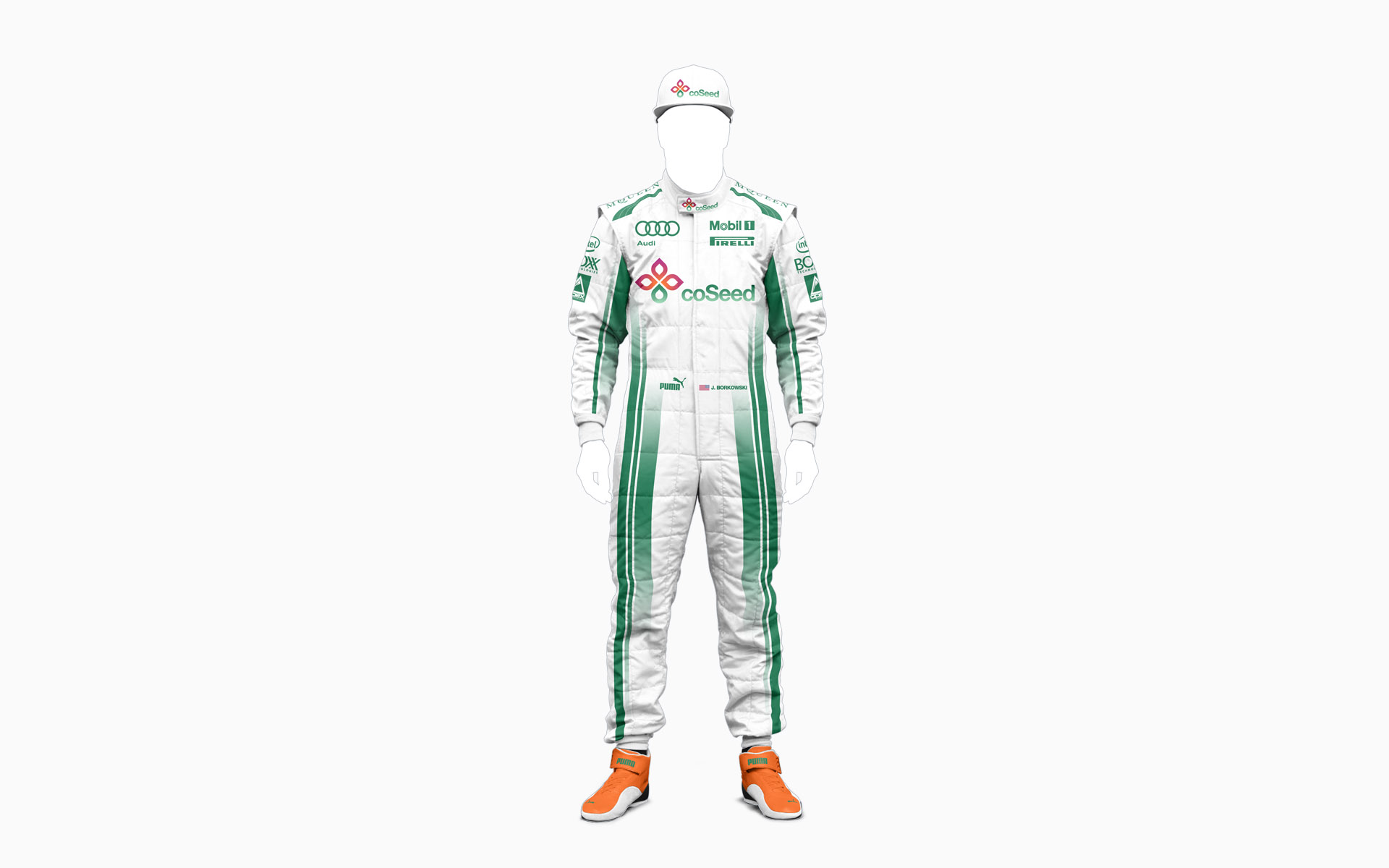
CoSeed F1 Driver Firesuit

CoSeed F1 Transporter Livery